This program had 4 different looks, dozens of graphics and almost as many patterns. Only two looks have been released to date, but I'll add more following their official release.
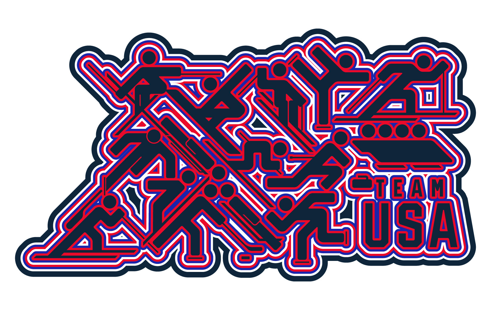
Radiant Geometry

The first look was based on a single graphic of mine and the client really loved it straight off the bat so it quickly ballooned into an entire section of the guide by itself.
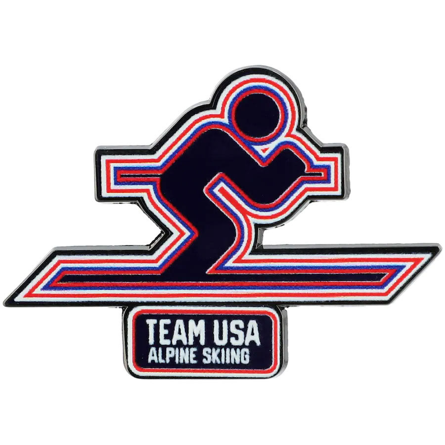
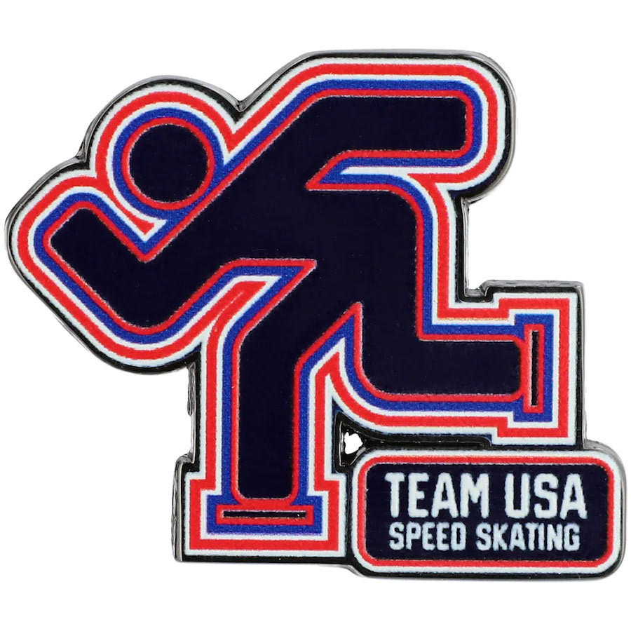
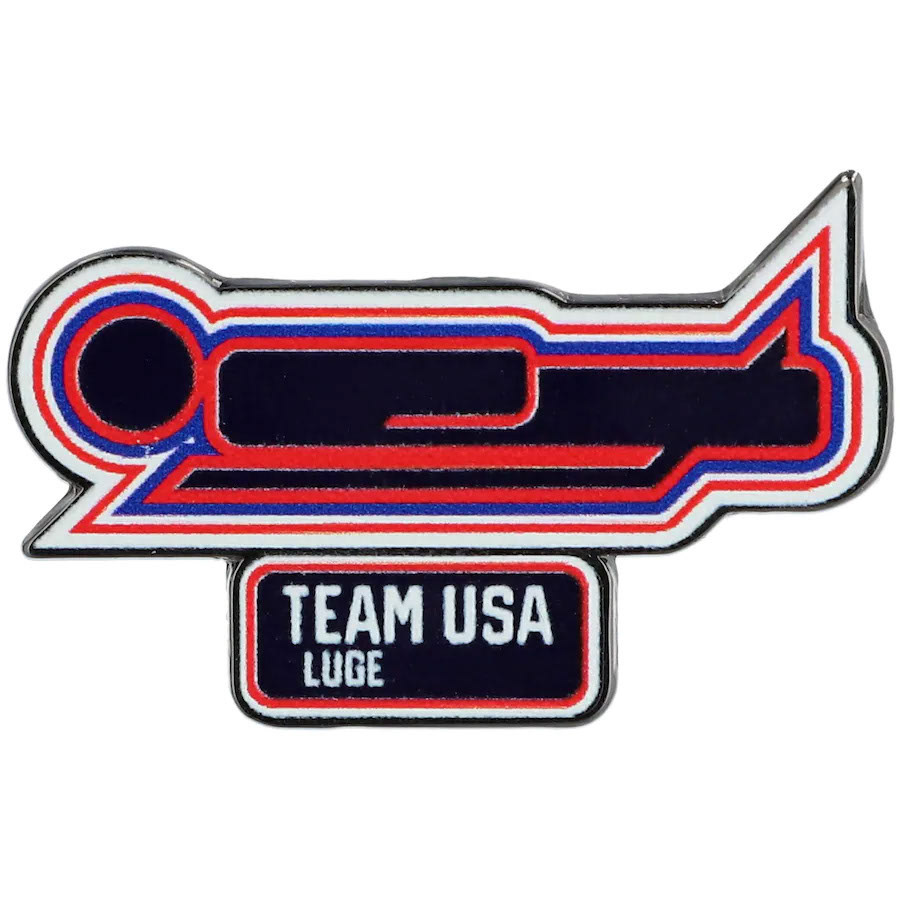
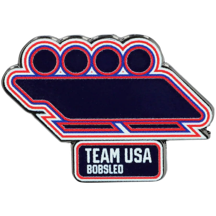
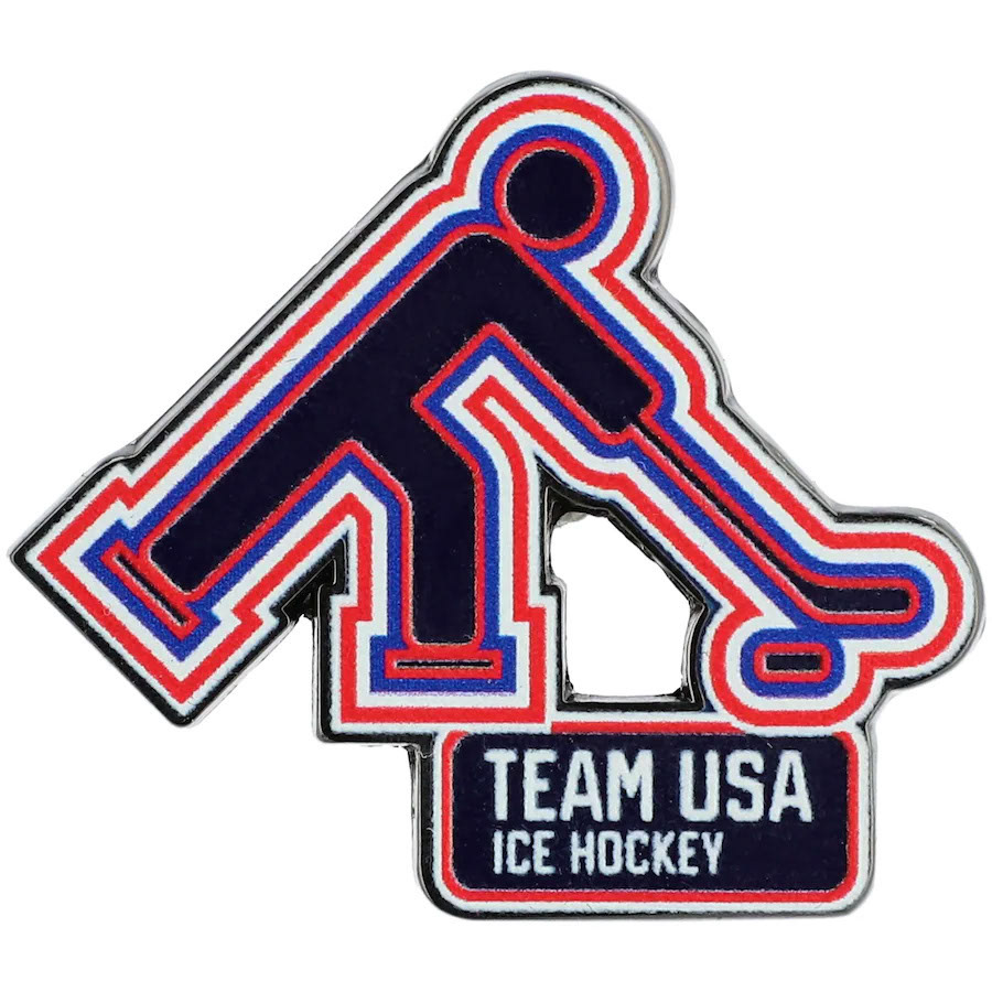
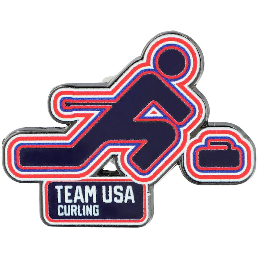
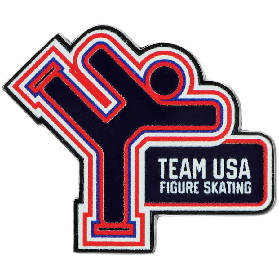
The style consisted of two halves. The thicker, more bold outlines seen at the top of the page and a second version of every graphic like you see on the enamel pins just above this text. This second version had much narrower, more delicate lines to be used for finer detail work like you see here.
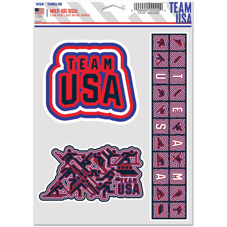
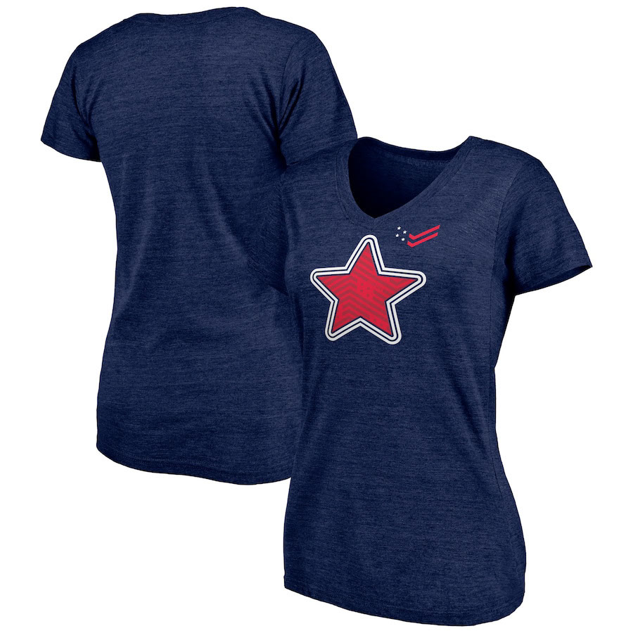
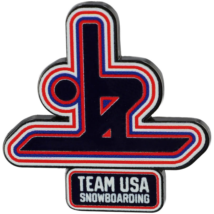
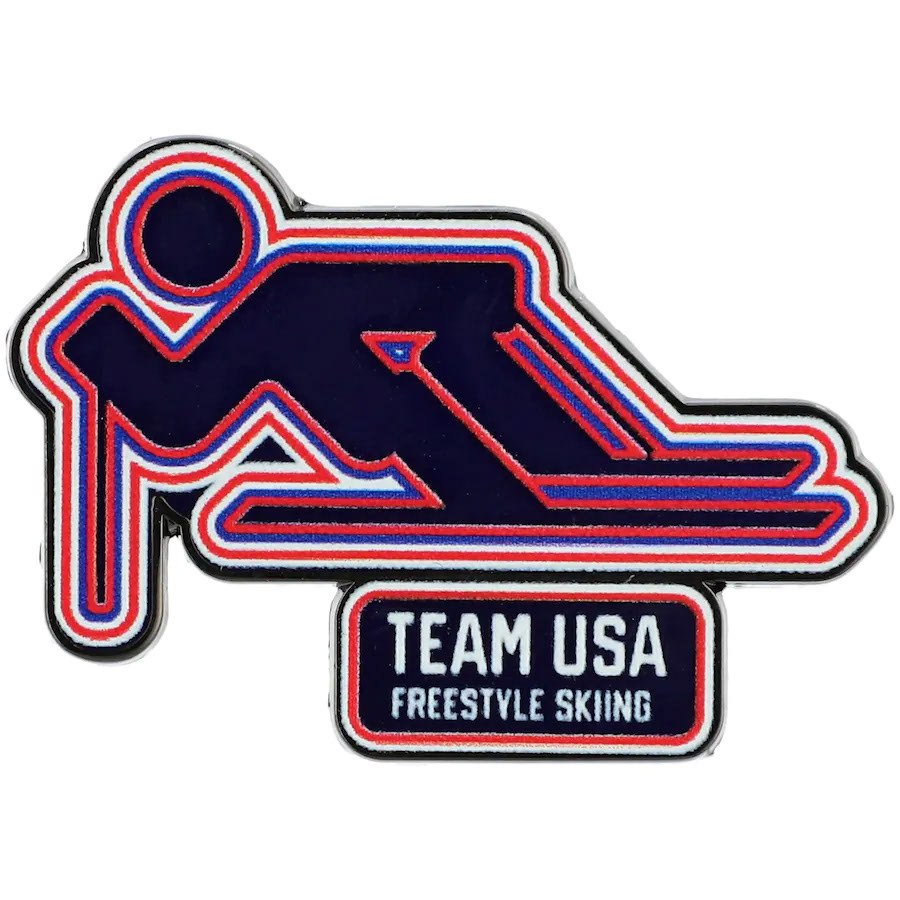
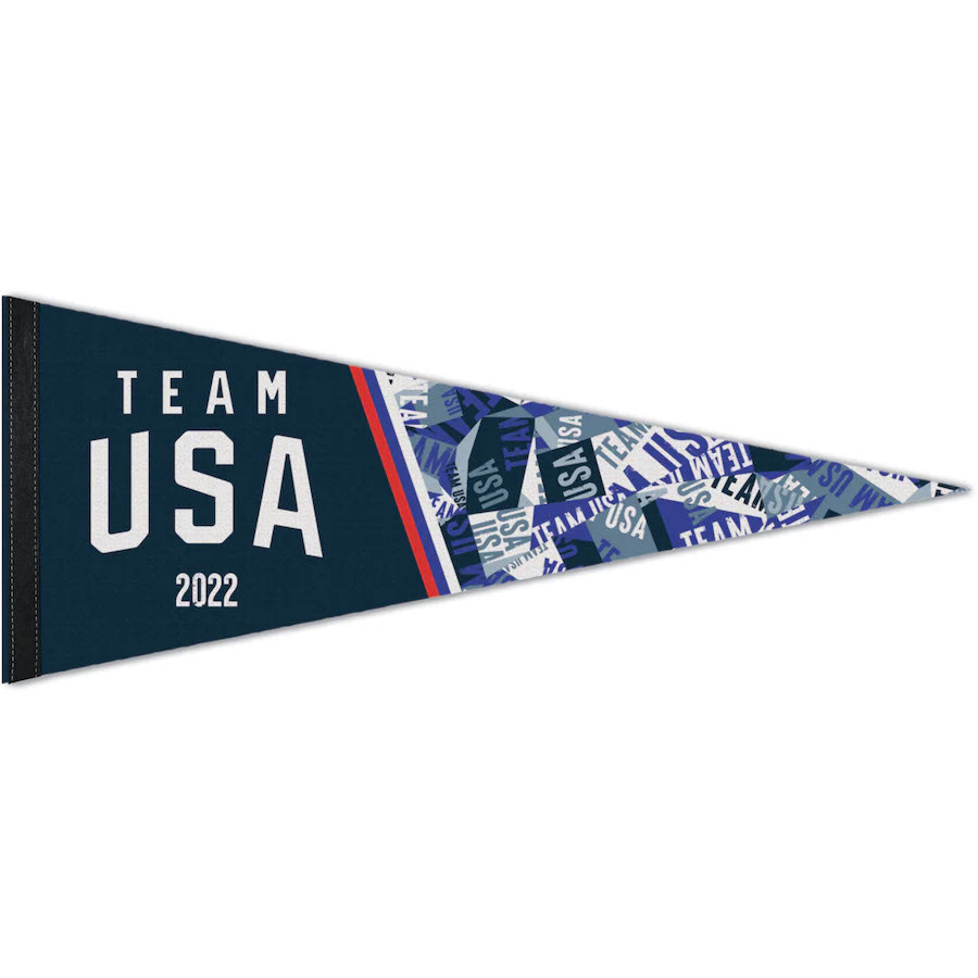
An important part of the program was a section in the style guide giving meticulous instructions for licensees on how to reproduce the effect to make new graphics of their own. The three images shown above are all examples of graphics created by other teams made to match the style of our program.
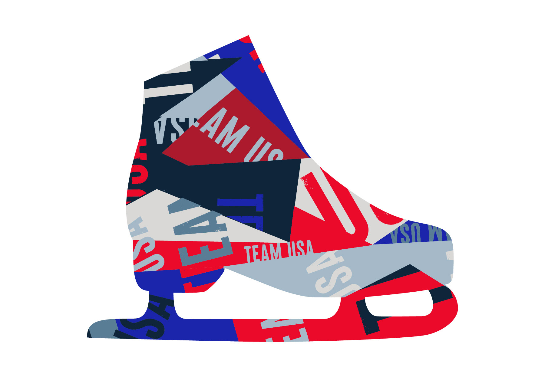
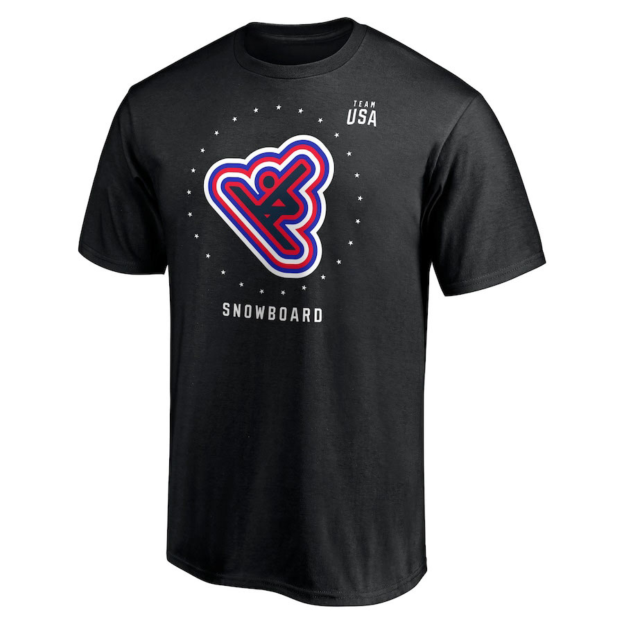
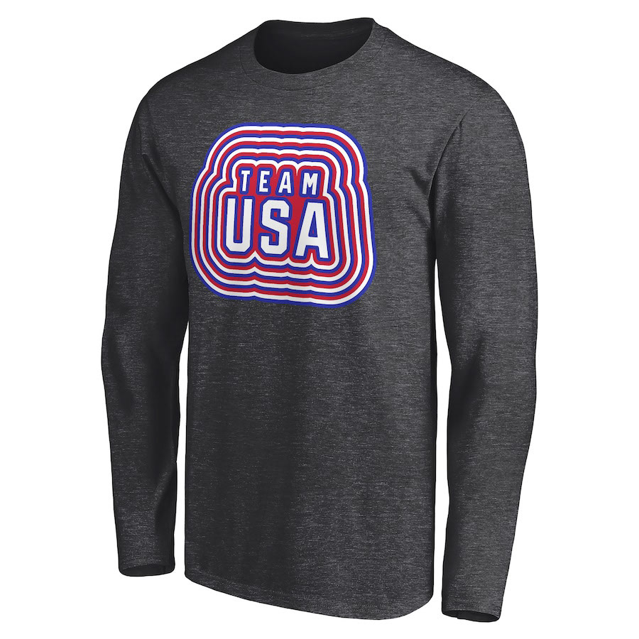
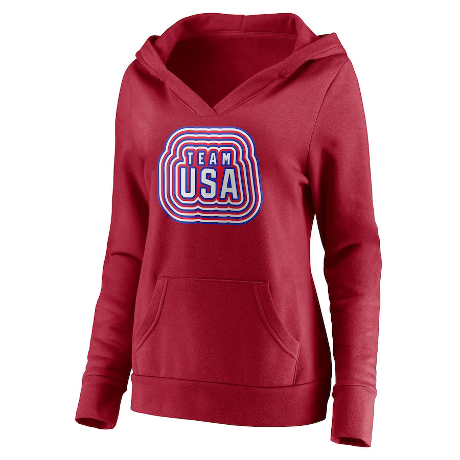
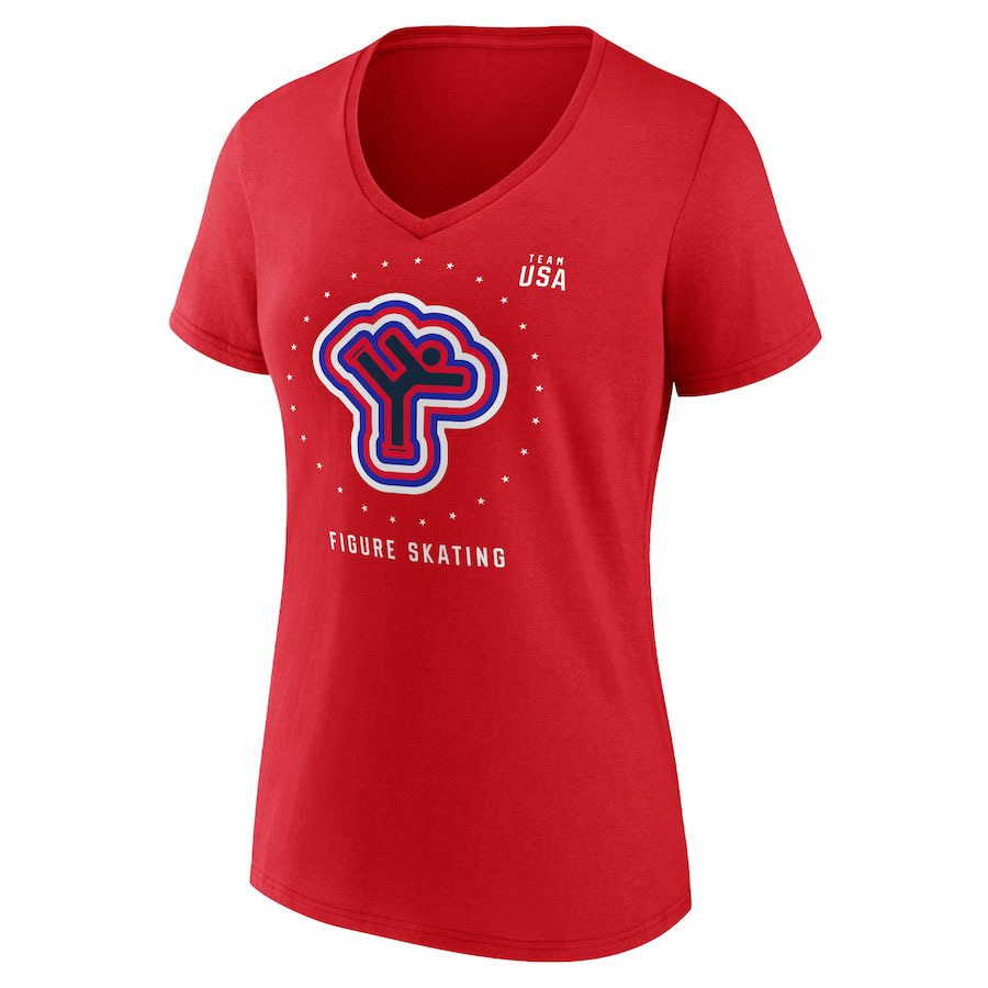
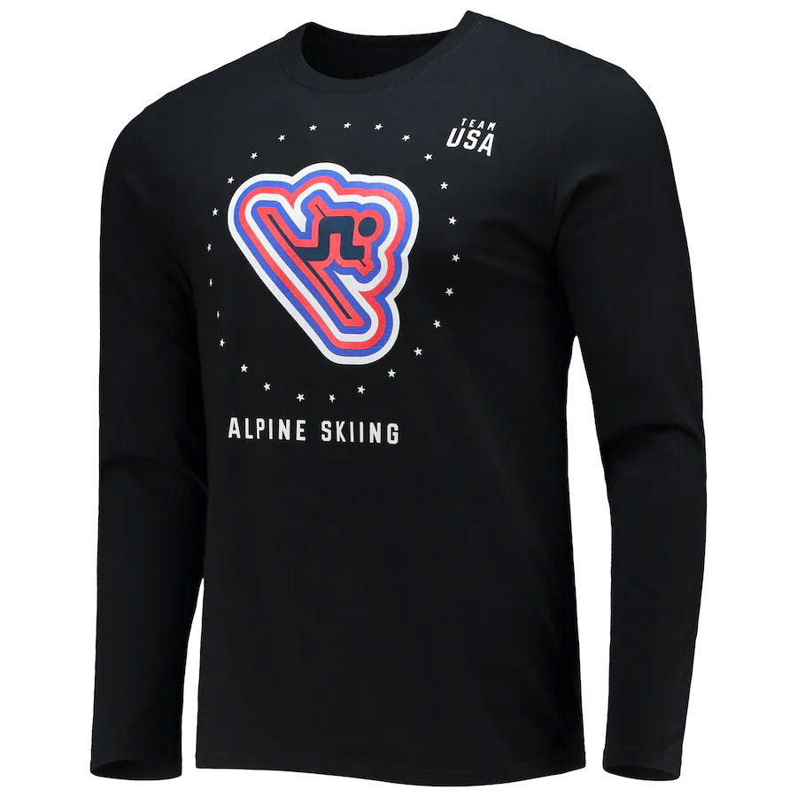
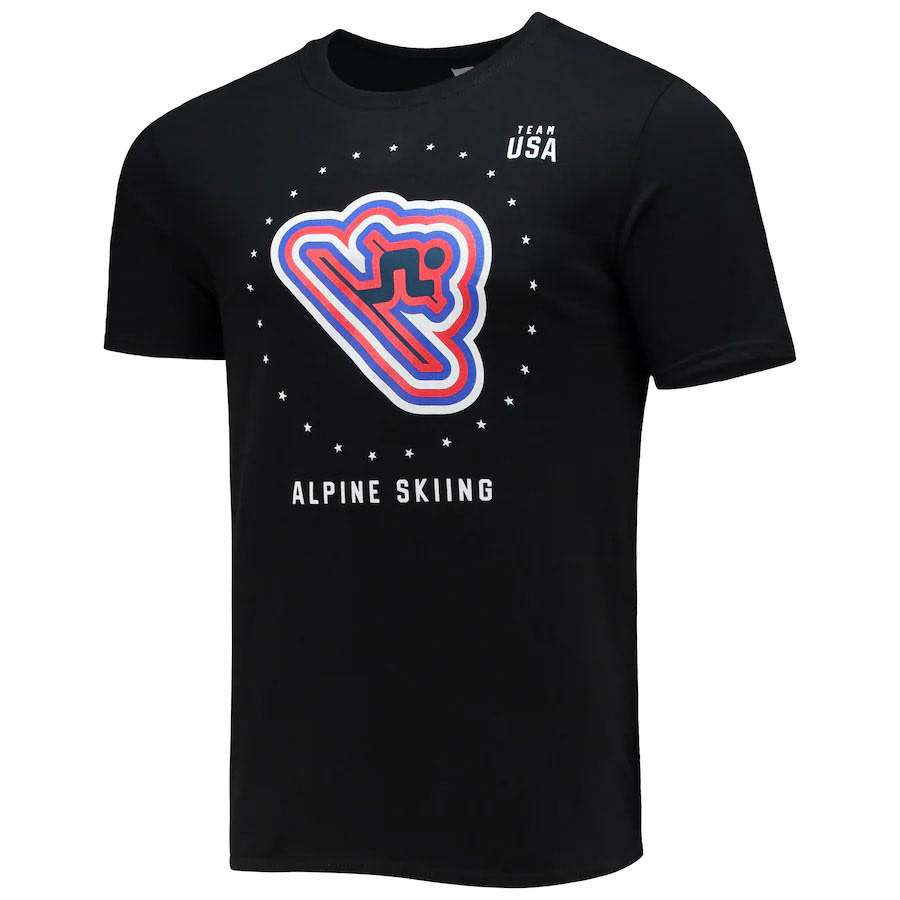
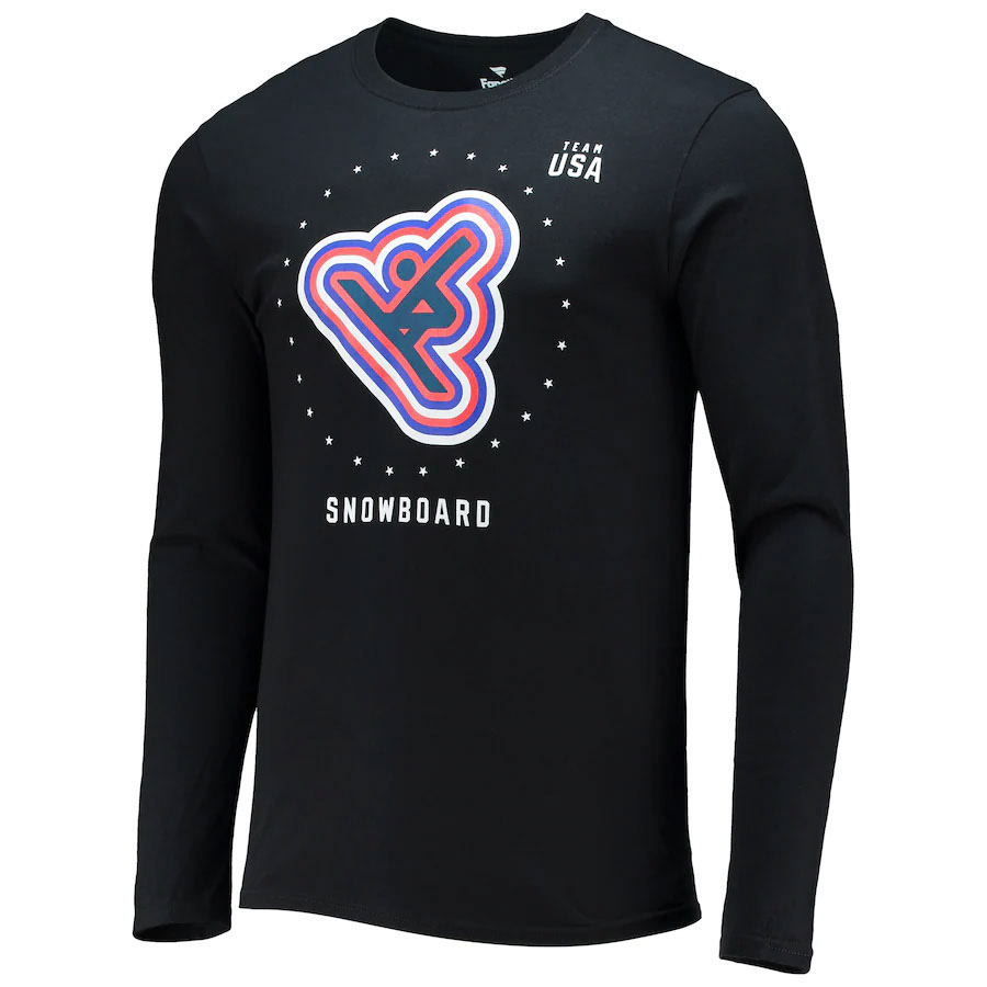
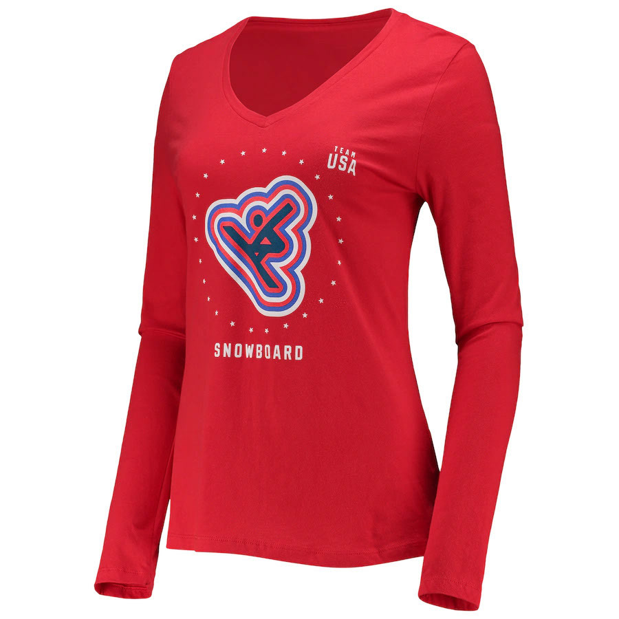
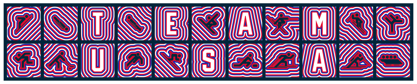
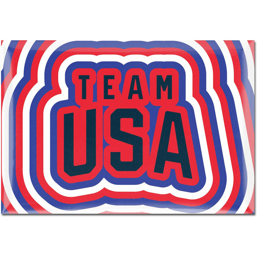
Shattered Swatch
The initial concept for this style was created by Tara Thompson, a designer who was on my team at the time. She's great. If you get the opportunity to work with her, take it.

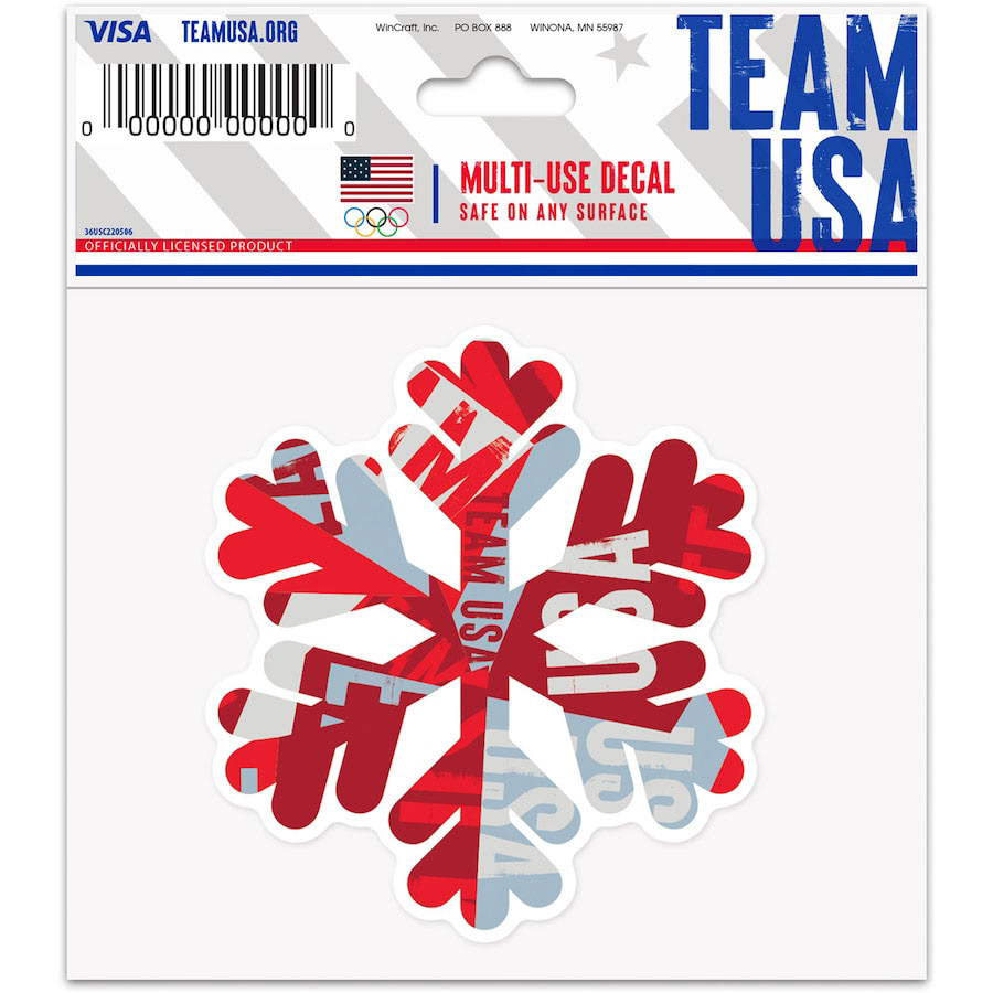
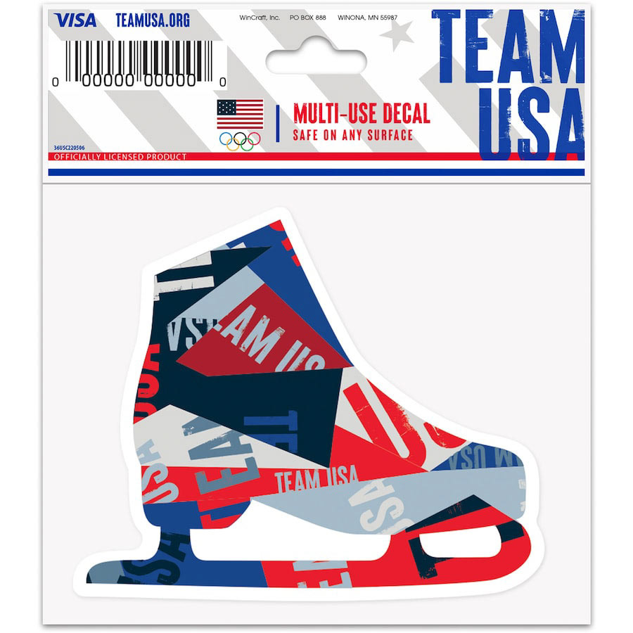
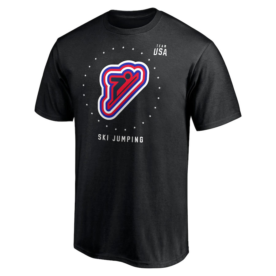
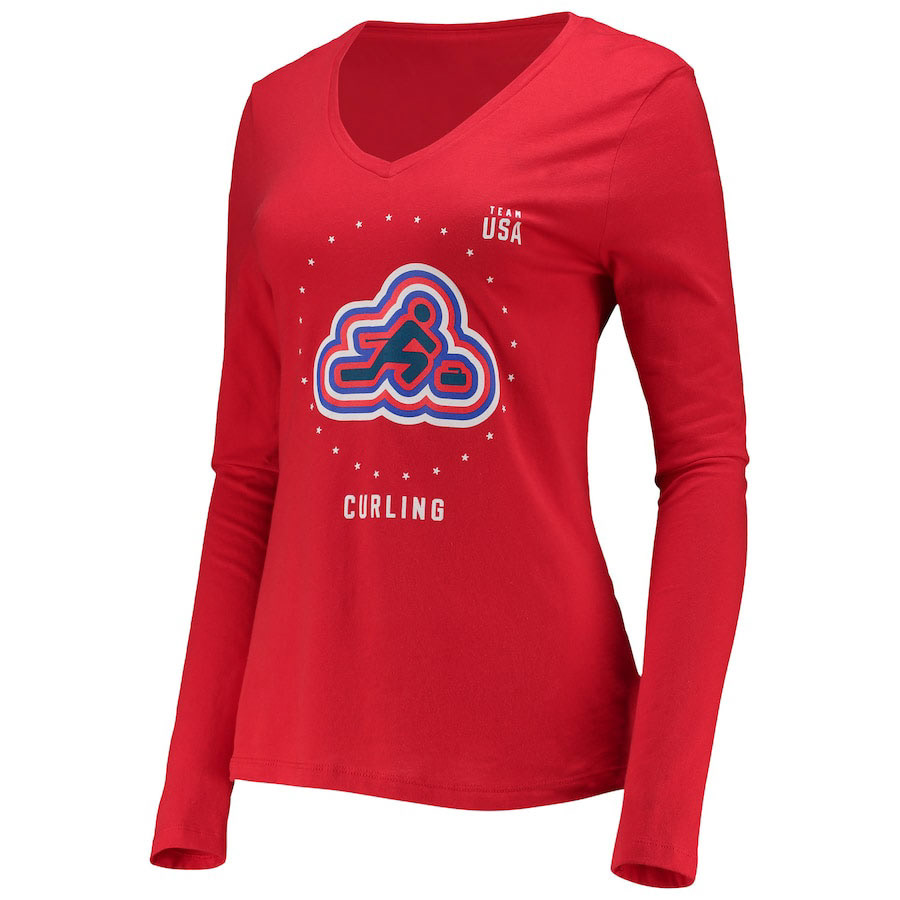
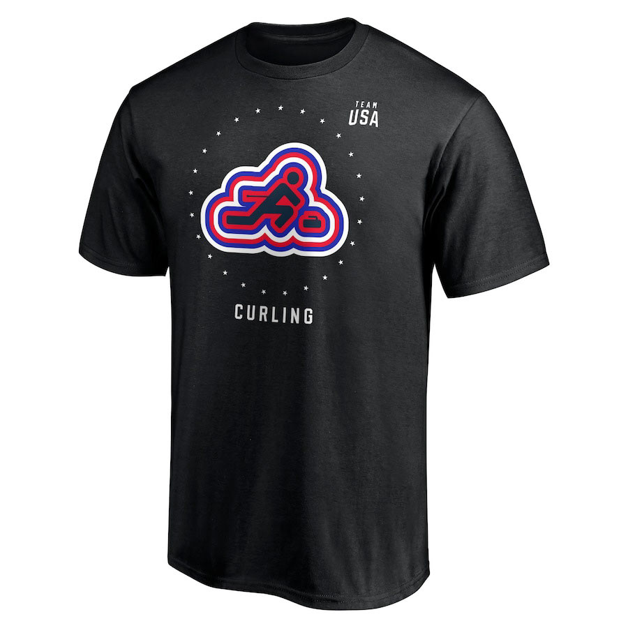
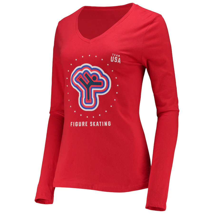
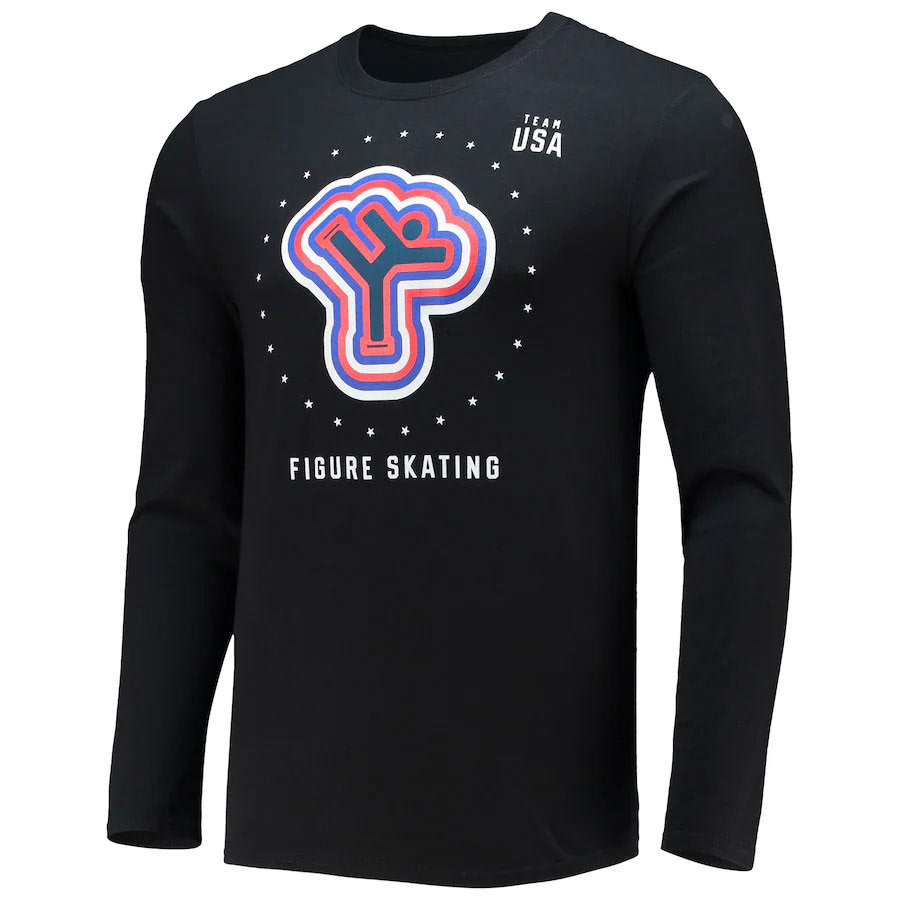
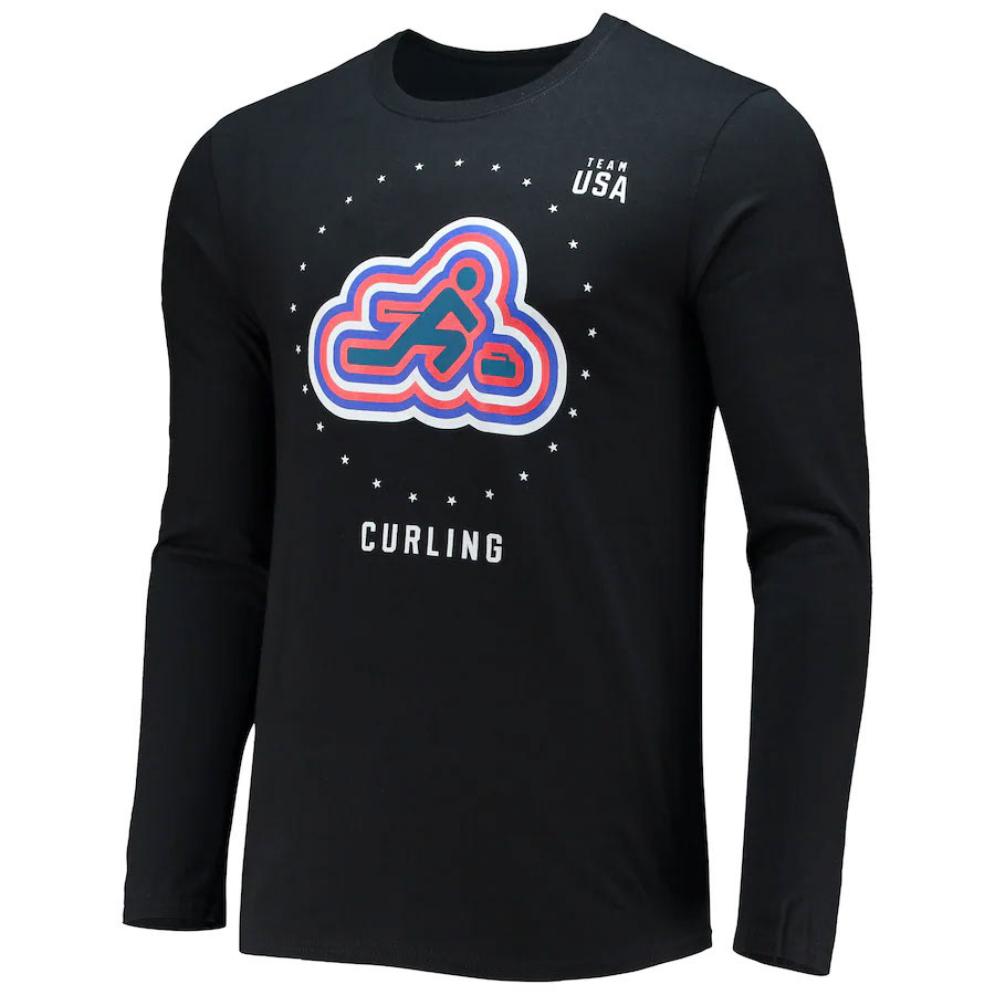
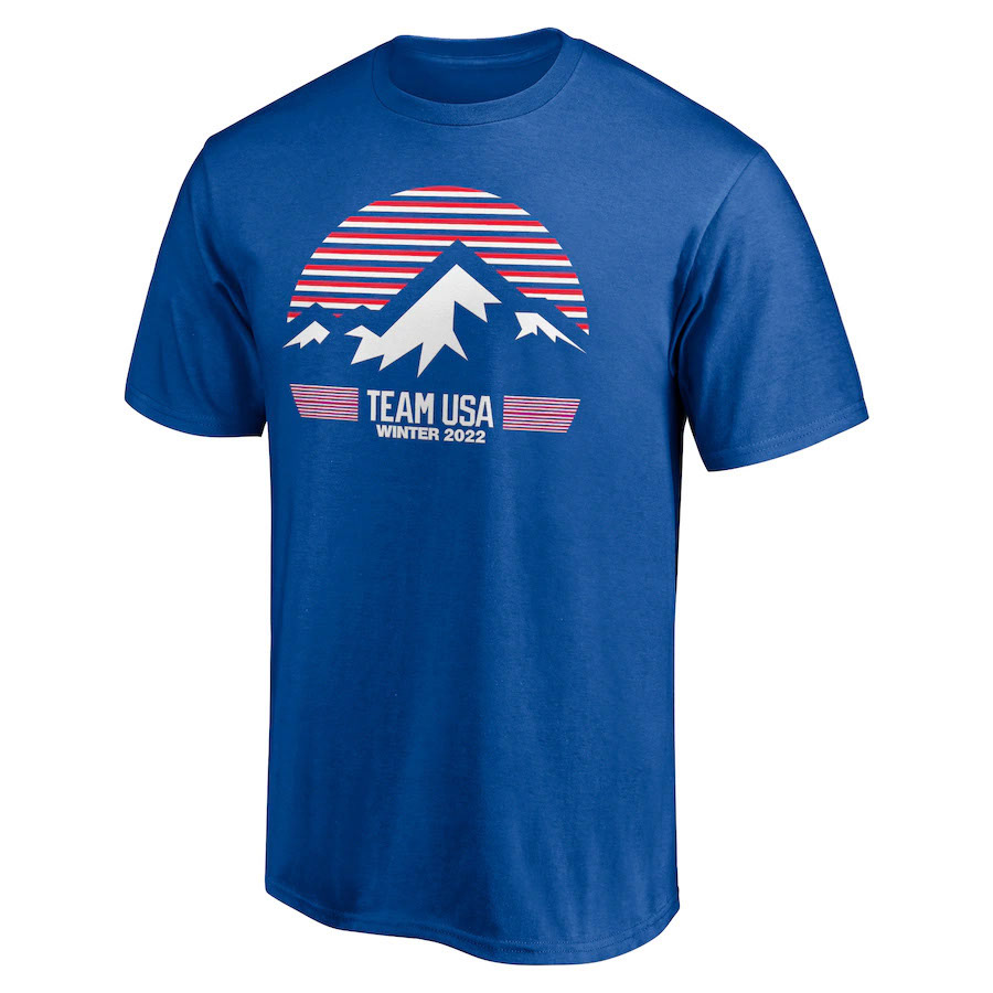
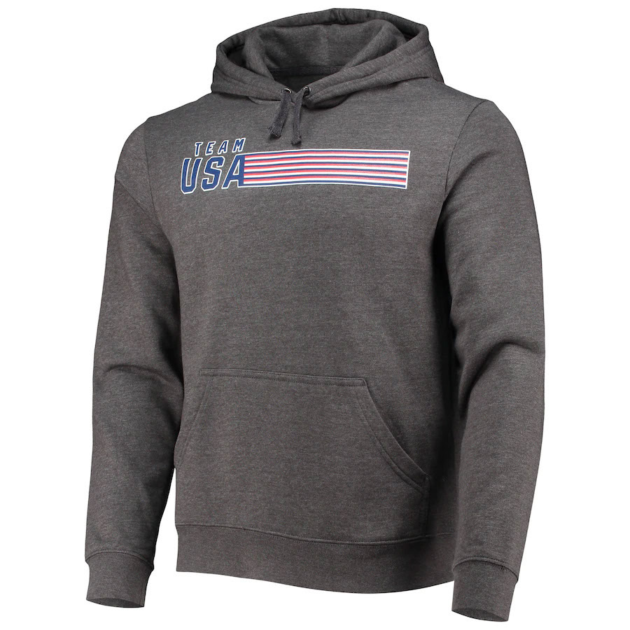
This style was primarily built around a single pattern with several color variations. The pattern is masked out and slightly reworked for each image to ensure that the team name is visible in every design.
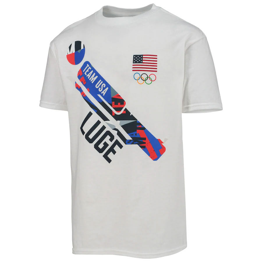
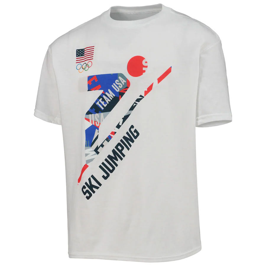
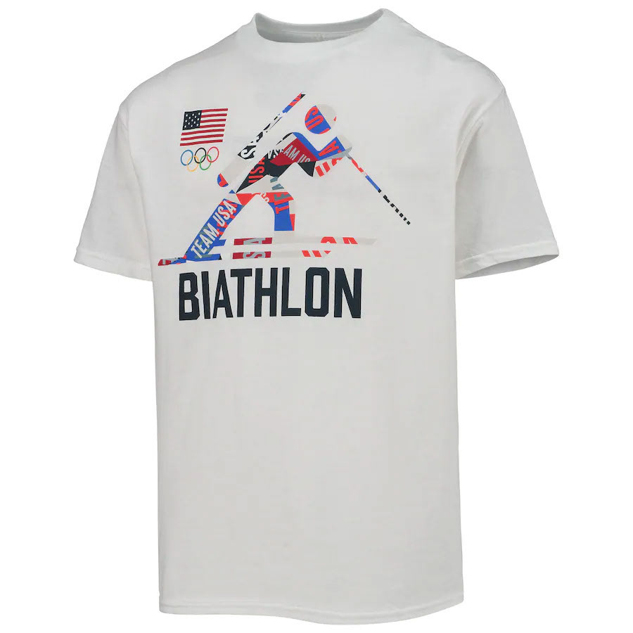
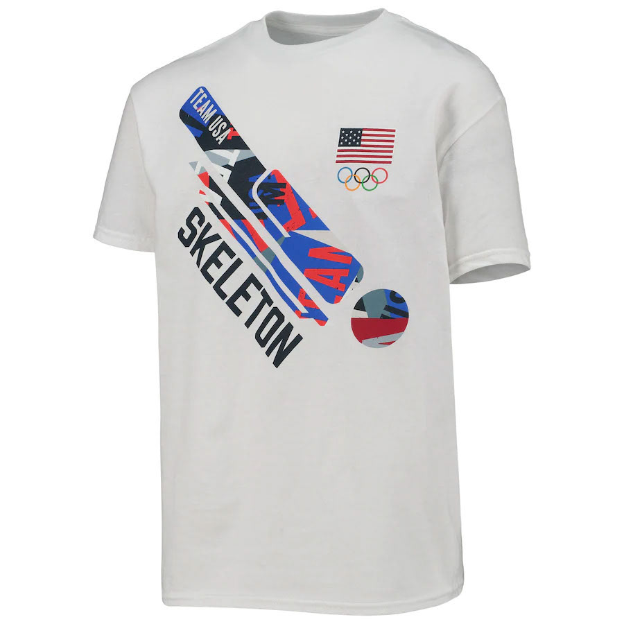
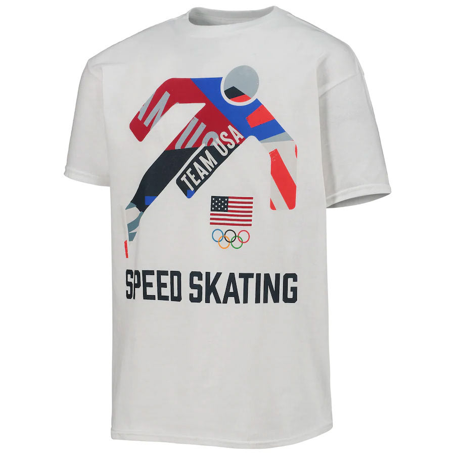
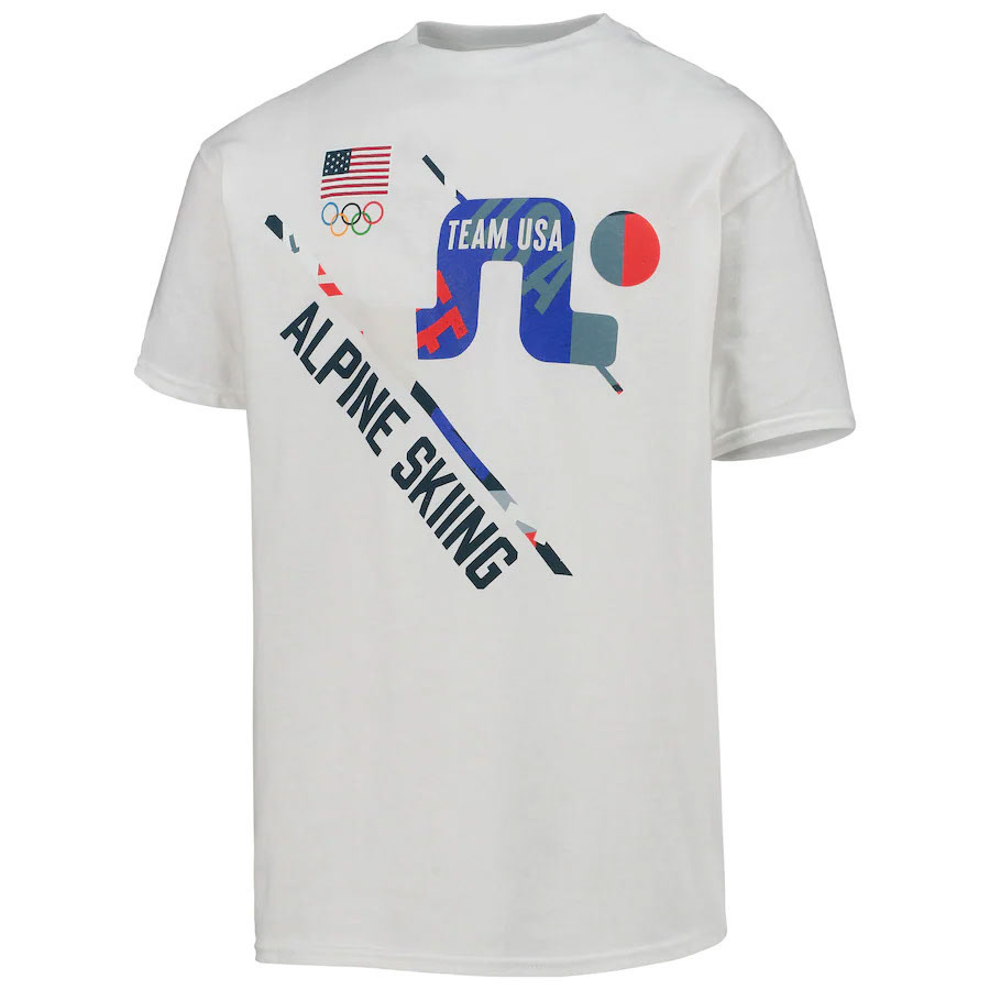
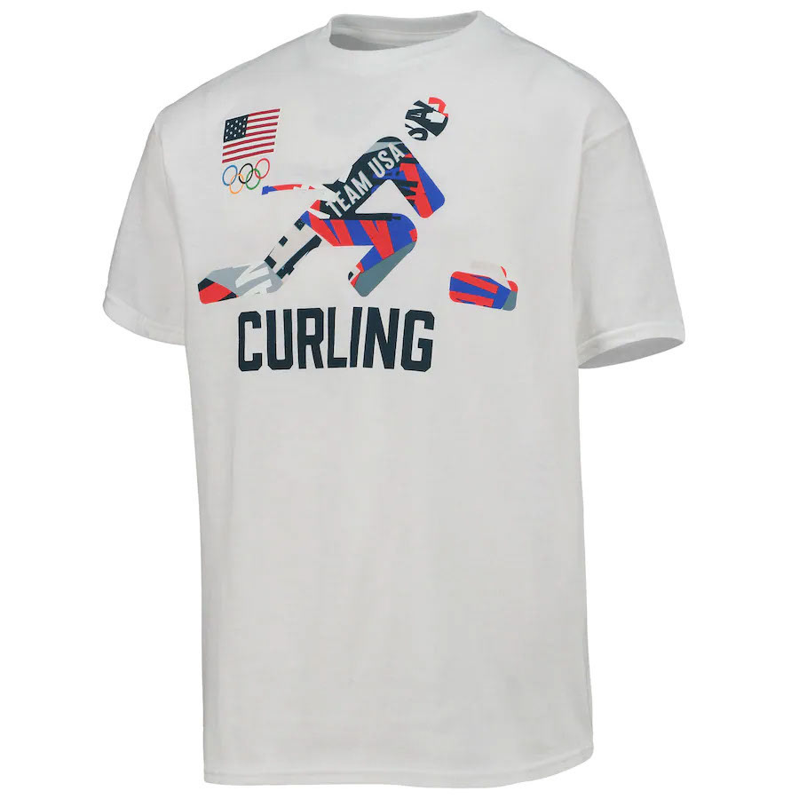
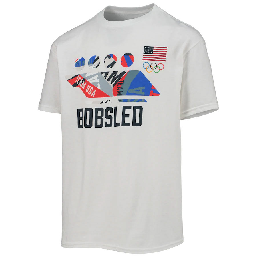
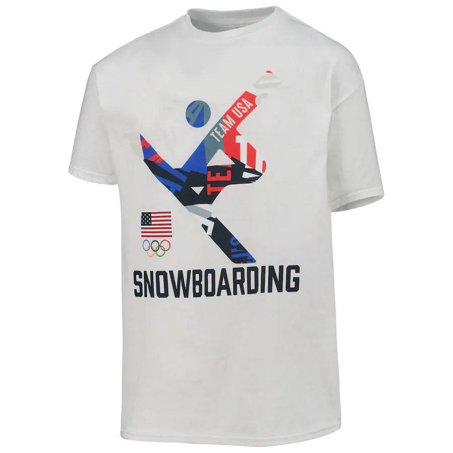
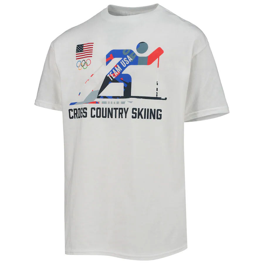
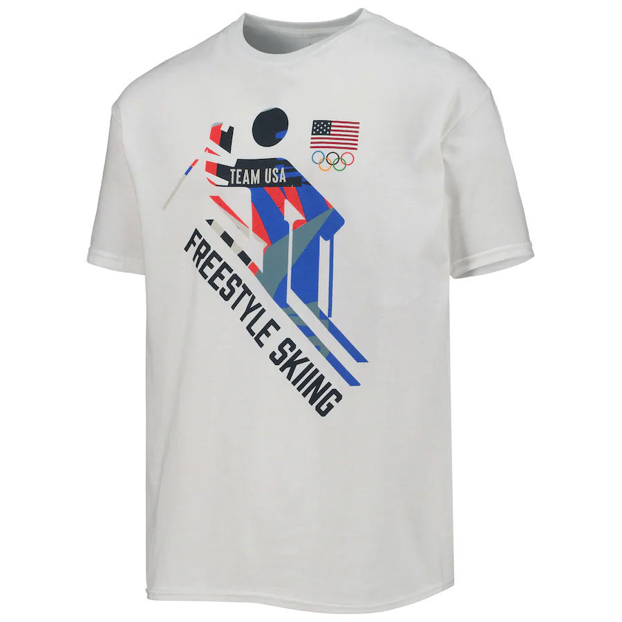
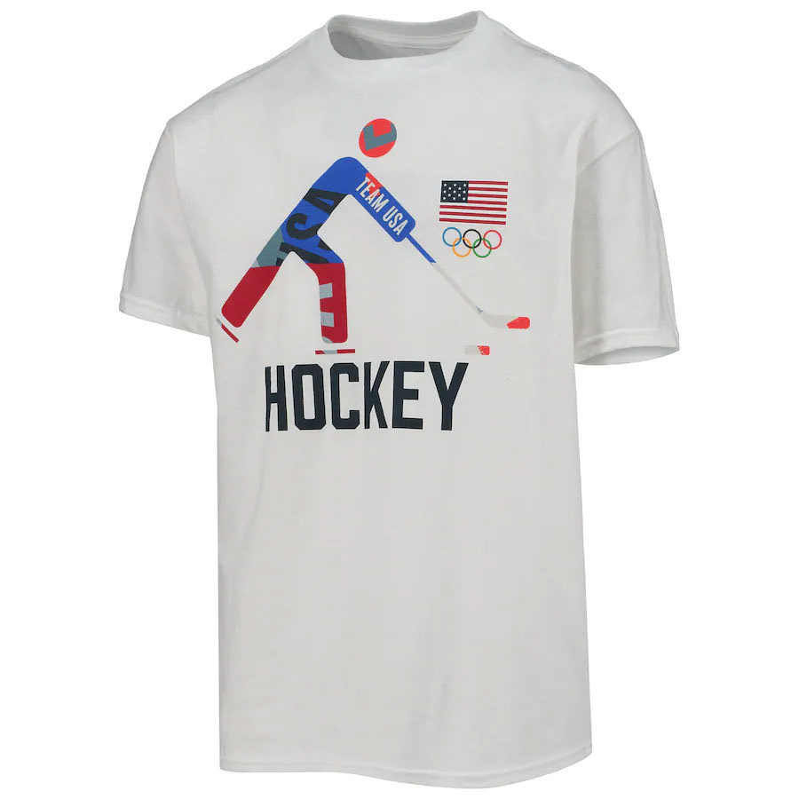
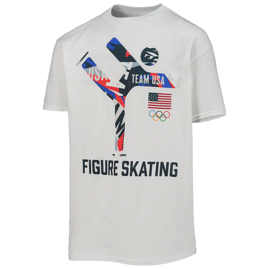
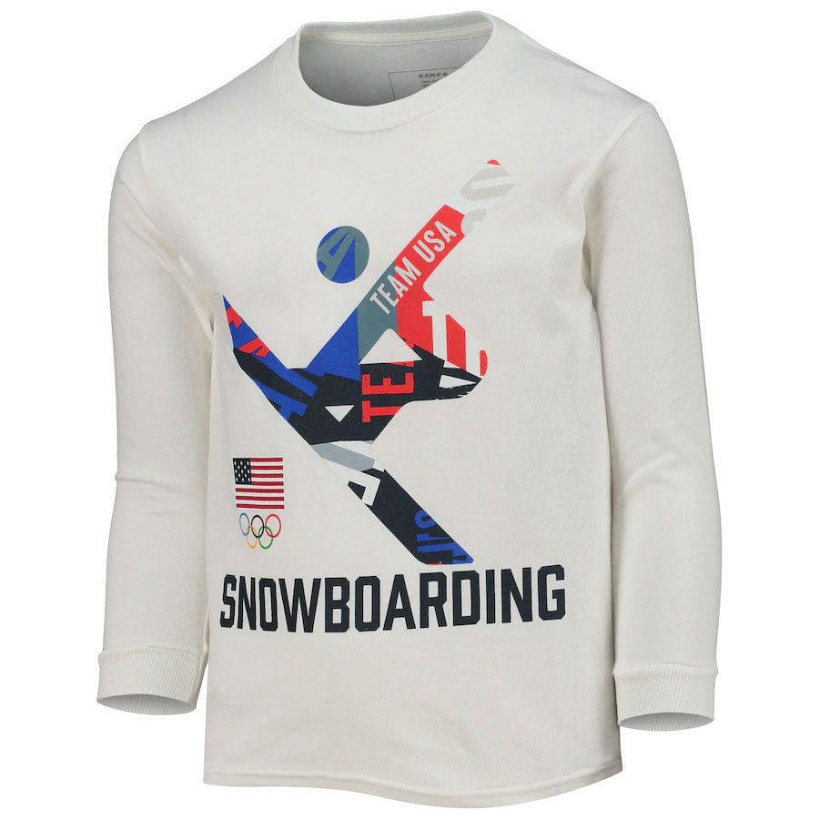

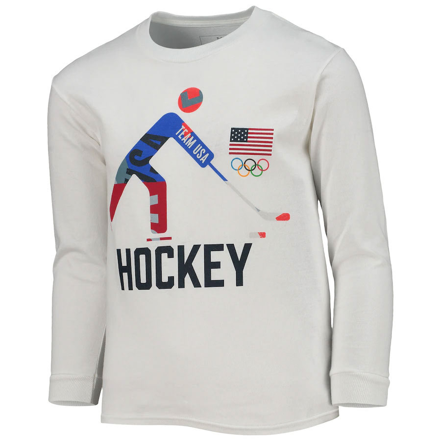
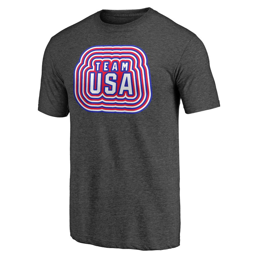
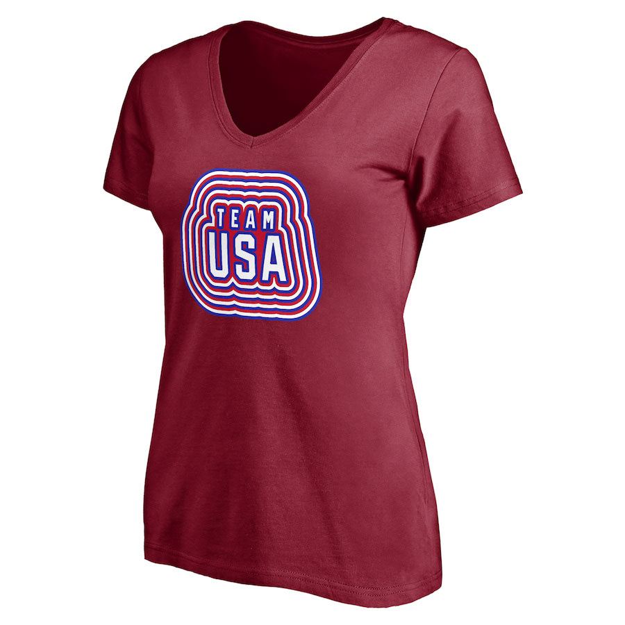
One graphic was made for each event in the Winter Olympics. The licensee who's produced the above shirts has adjusted the way that the logo and event name work from our original designs.
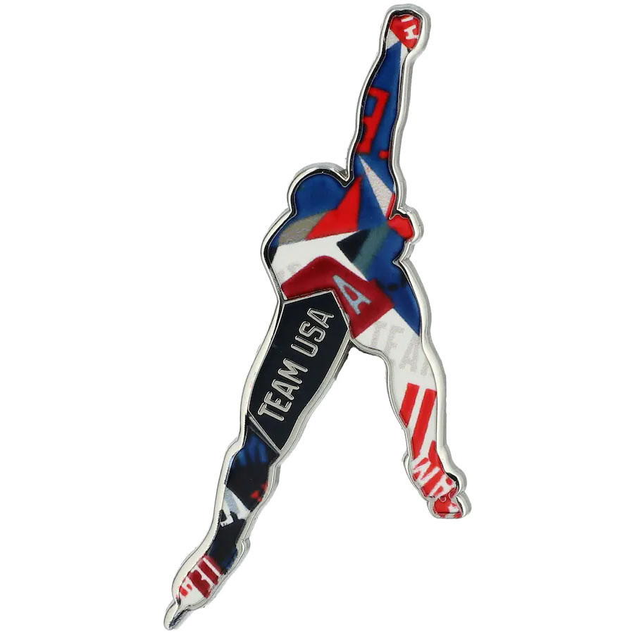
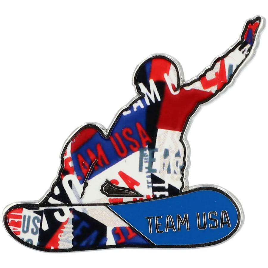

These two enamel pins are other examples of how licensees have taken our initial designs and used the style to create entirely new graphics.
